Every state, in one place.
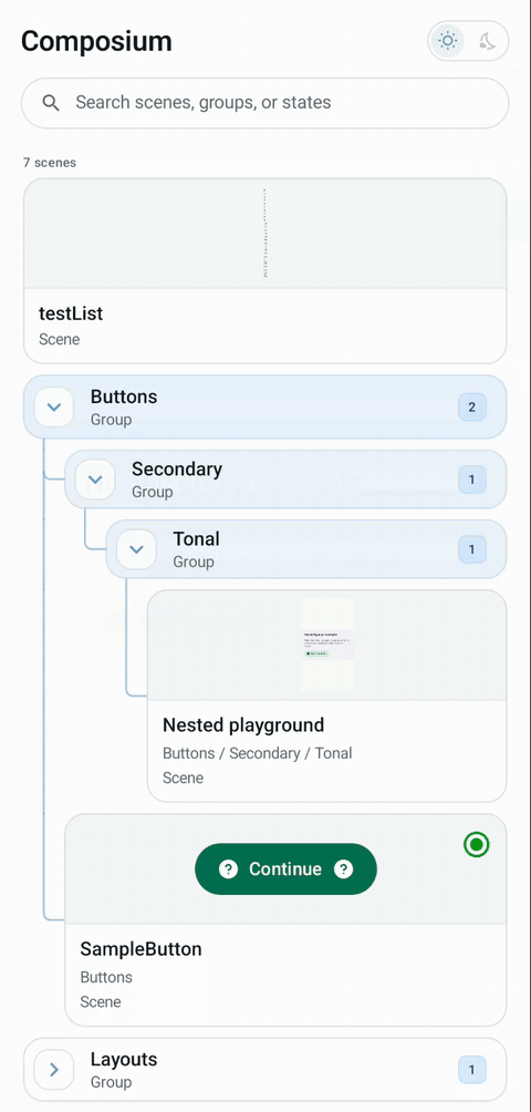
Organize scenes into searchable, nested groups. Automatic thumbnails and custom badges make your catalog easy to browse.
Explore scenesSTORYBOOK FOR ANDROID JETPACK COMPOSE
Turn your components into an interactive, in-app catalog. Explore real UI states, tweak parameters, and give your design system a place to live.
v1.3.0-alpha03 Pre-release/ Available on Maven Central
One composable. Anywhere in your app.
A WORKSPACE FOR YOUR UI
Keep the components, states, and edge cases you care about together—inside the app you already build.
Organize scenes into searchable, nested groups. Automatic thumbnails and custom badges make your catalog easy to browse.
Explore scenesEdit text, toggle booleans, and pick enum or sealed options at runtime. Bring your own choices for custom types.
Meet the parametersTry dark theme, larger fonts, different display sizes, and RTL. Review your UI under the conditions your users experience.
Adjust the environmentFROM COMPONENT TO CATALOG
Scenes are ordinary Compose code, with a few controls added. Your components keep their existing API.
Use google() and mavenCentral(), set compileSdk 36, and add the library and KSP processor.
Wrap your component in scene { }. Declare values with param() and let Composium build the controls.
Embed ComposiumScreen() in a debug route, activity, or internal tools screen. KSP discovers your annotated scenes.
Prefer manual registration? Skip KSP.
plugins {
    id("com.google.devtools.ksp") version "<ksp-version>"
}

dependencies {
    implementation("io.github.oleginvoke:composium:1.3.0-alpha03")
    ksp("io.github.oleginvoke:composium-processor:1.3.0-alpha03")
}
Choose a KSP2 version compatible with your Kotlin and AGP. See requirements →
import androidx.compose.foundation.layout.Box
import androidx.compose.foundation.layout.padding
import androidx.compose.material3.Button
import androidx.compose.material3.Text
import androidx.compose.ui.Modifier
import oleginvoke.com.composium.ComposiumScene
import oleginvoke.com.composium.scene

@ComposiumScene
internal val buttonScene by scene(
    group = "Buttons",
    name = "Primary",
) { contentPadding ->
    val enabled: Boolean by param(true)
    val label: String by param("Continue")

    Box(Modifier.padding(contentPadding)) {
        Button(onClick = {}, enabled = enabled) {
            Text(label)
        }
    }
}
ONE CATALOG, MANY REASONS
START WITH ONE SCENE
Small integration. A catalog that grows with your app.